From Broadsheet Columns to the Phone Screen: Why News Gets Framed
How news layout frames a story: follow one council report across print and phone screens to see how placement guides attention without proving intent.
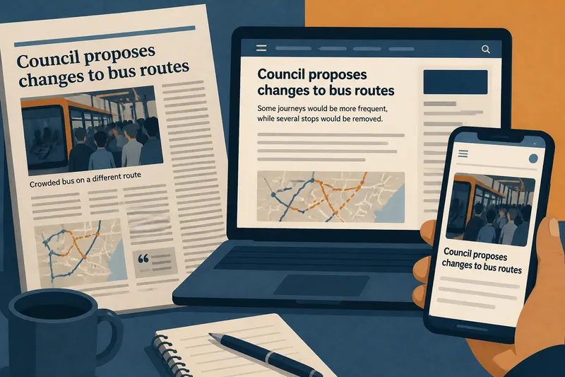
The common mistake with news layout is to treat the most prominent item as the most important—or as evidence that an editor wanted readers to reach a particular conclusion. That shortcut can turn a clue about attention into a claim about motive. To see the difference, follow how the same invented council story might appear in a broadsheet, on a news website and on a phone screen.
One report, several shapes
Imagine a council publishes a report about plans to change a town’s bus routes. The document says some journeys would become more frequent, while several stops would be removed. It includes a map, a summary, technical tables and comments from residents. Nothing about the report changes as it moves through news formats, but the space available, the order of elements and the reader’s route through them do.
In this imagined situation, a broadsheet page gives the story a headline, a photograph, several columns and a caption. A website presents a headline and standfirst above the opening paragraphs, with a map farther down. A phone app shows a compact card in a scrolling feed; a reader must tap it to reach the full story. These are not three separate accounts, yet they give the same material different first impressions.
“Framing” means the choices that make some aspects of a subject easier to notice than others. Layout is one part of framing, alongside word choice, images, ordering and the amount of explanation included. It shapes a reading path; by itself, it does not establish why that path was chosen.
The broadsheet page
On the print page, the story’s position matters because readers encounter a physical arrangement all at once. A large headline, a prominent photograph or a place near the top of a page can draw the eye before smaller items do. Column width and page breaks also affect how a reader moves between paragraphs, captions and adjacent material.
In the imagined council story, suppose the photograph shows a crowded bus, while the headline foregrounds the routes proposed for expansion. A reader might initially connect the plan with overcrowding. If the caption identifies the photograph as an image of a different route, that qualification changes how the image can fairly be read. If the caption is missed or separated from the picture, the impression may persist without its context.
Print also puts neighbouring stories within view. A report placed near coverage of transport delays may seem part of a larger pattern, even if the two stories concern different routes or causes. That association can be useful when the relationship is explained; proximity alone does not show that the stories share evidence.
The website sequence
A web page unfolds as the reader scrolls. The headline and opening paragraphs arrive first; a chart, map, source link or later quotation may appear farther down. Readers who leave early may encounter a real but incomplete slice of the account. The page’s order therefore affects which details are most likely to be seen before a reader forms an impression.
Say the imagined article opens with the residents whose stops may disappear, then explains the proposed extra services, and later links to the council’s route map. That order gives the disruption immediate human detail. It does not make the map irrelevant, and it does not establish that the writer or editor intended readers to overlook it. The sequence may reflect the story’s central question, the reporting available or the page’s design.
Web pages can also place navigation menus, related links, captions and adverts beside the article. A label such as “More on transport” may help readers find related reporting, while a recommended story can pull attention towards another issue. To assess a connection, open the linked item and check what it actually says rather than treating its position as evidence.
The phone-screen crop
A phone narrows the visible area, so items that once sat together may arrive in sequence or be partly hidden. A feed card may show a short headline and a cropped image but not the caption, standfirst or qualifying paragraph. A photograph can retain its emotional force even when the words that explain its date or location are off-screen.
In our invented situation, the app card shows the crowded-bus image and a shortened headline about route changes. On tapping through, the reader finds the full story, including a caption that says the bus is from a different route. The first screen has not supplied enough information to settle what the picture demonstrates; the expanded article offers a relevant correction to the initial impression.
Screen size is only part of the change. A reader may enter through a notification, a search result, a social post or the publication’s home page. Each entry point can show a different image, label or excerpt. Before judging the article as a whole, check whether the version on screen is a preview, a live page or a shared extract.
Reading the layout
A layout is easier to assess when you treat it as a reading sequence: note what the first screen shows, then compare it with the full article and its captions, links and supporting material. The questions below help distinguish what the design makes visible from what it can actually establish.
What does a prominent position tell me?
It tells you that the item has been given visible space in that particular format. It does not, on its own, tell you whether the placement reflects public importance, editorial judgement, a developing story or a design decision.
Can a photograph prove the article’s point?
A photograph can show what was in the frame when it was taken, but its caption, date and location affect what it can support. Check whether the image illustrates the specific event or is being used more generally.
Why do print and mobile versions differ?
They have different dimensions and reading patterns, so a page may become a feed card, a scrollable article or a short preview. Compare the full versions before attributing a difference to a deliberate editorial position.
How can I check what I have not seen?
Open the full article, inspect captions and links, and look for maps or documents mentioned in the text. If a claim depends on a missing detail, note that gap rather than filling it with an assumption about motive.
Separate effect from intent
Layout can have an observable effect without revealing a private intention. If readers see a picture before its caption, the picture may shape their first impression; that is a statement about the reading sequence. Saying the editor placed it there to mislead is a different claim, which needs evidence about purpose, not merely a description of position.
For the invented bus story, a careful reader could record that the app preview foregrounds a crowded bus, that the caption identifies another route, and that the full article discusses both removed stops and increased services. Those observations describe what the reader can check. A claim that the publication wanted to disguise the service increase would need support beyond the card’s cropped view.
It is also useful to distinguish prominence from completeness. A large image can attract attention while carrying little information about the proposed routes. Conversely, a small map may contain the precise stop changes but require more effort to interpret. Neither visual size nor technical detail is a reliable measure of evidential weight.
A useful reading path
When a layout gives you a strong first impression, pause long enough to establish what is visible and what is missing. For each check, the observation should lead to a clear next decision:
- Check whether you are looking at a printed page, full web article, app card or shared preview. If it is a preview, open the full account; if it is already the full account, continue to the headline and opening paragraphs.
- Check what appears first: headline, image, caption, standfirst or opening paragraph. If the caption or qualifying text is absent, look for it before drawing a conclusion; if it is present, read it alongside the image.
- Check the image caption and nearby labels for date, place and subject. If any of these are unclear, treat the image as limited evidence; if they are specified, compare them with the event described in the text.
- Check the full account for details that qualify the preview. If the article adds relevant context, revise your description of the first impression; if it does not, record that the detail remains unprovided.
- Check links to maps, documents or related coverage mentioned in the story. If a link supports the stated connection, describe what it shows; if it concerns a different route or issue, do not treat its placement as proof of a shared cause.
- Check whether your statement describes a visible effect or an editor’s presumed purpose. If it describes position, sequence or cropping, report that observable feature; if it alleges intent, seek evidence beyond the layout or leave the motive uncertain.
Imagine you see the council story in a feed and infer that the plan mainly removes services because the cropped card shows a worried passenger beneath a short headline. You open the article and read the caption, which identifies the passenger’s bus as serving a different route; you then inspect the route map, which marks proposed extra journeys as well as stops slated for removal, and read the paragraph explaining those changes. The resulting account is that the preview foregrounded disruption while the full report described both removals and additions; it does not settle whether the plan is desirable or reveal why the editor selected that image.
The point of comparing broadsheet columns with a phone screen is not to discover a hidden editorial motive in every design choice. It is to see how position, sequence and cropping guide attention, then check what the complete account adds. When you describe that path precisely, you can question a frame without mistaking its visible effect for proof of intent.